this september i had the opportunity to visit the beth cavener stitcher exhibition at the claire oliver gallery in chelsea, new york and in all honesty, i can’t remember the last time i was this impressed with art, let alone contemporary art.


the adoration (from van eyck)

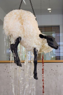
“beth cavener stichter addresses controversial, potentially embarrassing subject matter head on and in direct opposition to the reputation of her chosen medium, clay. by employing this classical genre and emphasizing its primitive and raw characteristics, cavener stichter intentionally provokes art-world prejudices. the artist thrives in the depiction of the provocative, blatantly contradicting the traditional and comfortable uses of her medium and imagery. cavener stichter explores child abuse, pornography, self loathing, and insecurity through elegantly crafted goat, hare, and hound proxy. “i select animal subjects,” she says, “since the animal body is removed just enough from my own to establish a distance, yet the personal relationship is irresistible.. here, i become far enough away from myself to unravel questions previously tangled in a self-conscious quagmire.”” (via here.)

admittedly, provocation through art in nothing new. on the contrary, it is such an overused technique that most of what we see nowadays can be described as “provocation just because” (i.e., most artists featured in vice magazine, not to be disrespectful). (most of*) beth cavener stichter’s art on the other hand is so beautiful, one can choose to fully ignore the provocative side of it and just perceive it for its aesthetic values.

* i personally have my issues with some of the sculptures, but that is a personal point of view i will choose not to discuss here.

the white hind (the bride)

no tongue can tell

images via claire oliver.


caved in and bought this ann demeulemeester wrap-around sequin skirt. it’s not what i usually got for and i’m not too sure i will wear it simply as a skirt (might use it when layering clothes etc.), but it was just too good of a deal to pass by.

waiting in line in front of the H&M store at 7AM.

such is the reality of the situation – after giving it much thought, i finally caved in and went to queue in front of the local H&M store, so i could purchase a few things from the new maison martin margiela collaboration. there are definitely designers i love way more than martin margiela, but it would be a lie to tell that the house he established and its ideas don’t tickle my fancy. this is also where the dilemma comes from – as a fan, a “i’m sure martin margiela himself would have hated the idea of such a collaboration, especially considering all the publicity.” kept playing over and over again at the back of my mind. and i still think so – a collaboration with a fast fashion brand is definitely not what the house once stood for. but life is life and such things happen..

all of that aside, as i already said, i decided to go and buy a few, more like two, things – the faceless watch and the glove coin purse. as you all probably know, most (all?) of the items are re-editions of older ones, those two not being an exception. i fell in love with the faceless watch the first time i saw it, and still do. the idea of time and/or timelessness has always intrigued and inspired me, so being able to incorporate it in the way i dress has been something that really excited me. admittedly, it’s not the first such piece i own, but that is what made it even better – i really liked the idea of combining it with my natalia brilli nolex watch. sadly, i have a tiny baby wrist, so the watch will probably have to be modified somehow. because, yes, it is actually a mens watch, if i forgot to mention..

the other thing i got was the glove coin purse, because apparently i’m starting a glove purse collection now (after my undercover glove clutch). i’ve loved the original piece for so long now, but since it’s so hard to find nowadays, i had to make do with what was being offered – a.k.a, the H&M version. still, it’s a lovely little bag and just enough of a minimal, yet statement piece for me to like.

not going to elaborate on the shopping experience itself, as it had it’s ups and downs and overall wasn’t the best one i’ve ever had, but it was fun, definitely the first time i ever queue for something like this.

and in case any of you suddenly feel overwhelmed by this, honestly disgustingly commercial, side of it all, i’d suggest you go view the beautiful archival images over at history of our world, you won’t regret it!

FLORIAN NEUVILLE by  PIERRE DEBUSSCHERE

©254FOREST

i rarely get inspired by editorials, especially in a way where i think how i should get this and this and wear this and this is a certain way. but this picture really makes me want to buy a high-waisted wool skirt in black so i can wear my raf simons shirt (yes, i do own this shirt) the way it’s styled here. simply amazing!

Image

i don’t really remember how i first discovered gosha rubchinskiy, but ever since his works have been haunting me. skinheads, football hooligans, metalheads, ’90s youth, post-perestroyka youth. according to rubchinskiy himself (according to this site), “his muse reads the bible and victor pelevin’s novels, is into orthodoxy, runes, numerology, football, satanism and shamanism“. i won’t be the first, nor the last to say it, but in all of that – in his inspirations and aesthetics, even in the people he caters to – i see late ’90s/early ’00s raf simons. and in that sense i don’t know whether i should say that he’s a breath of fresh air or if he’s that odd perfume that evokes memories of “the good old days”, but whichever of the two he is – or hell, even if he’s neither – i think we can all appreciate his vision, considering it’s not something we see every day nowadays.

you can see pictures from his autumn/winter 2012-13 collection below (via lookatme). based on the youth culture of the russian city of arkhangelsk, you can feel its spirit not only in the garments themselves, but in the presentation as well – as rubchinskiy himself has stated, he is not a designer, he is a an artist that enjoys designing clothes. and that is what i enjoy about his work – it’s not just clothes for the sake of clothes, it’s a piece of a specific era, a piece of a specific spirit of youth.


some of my favourite garments of his have to be the spring/summer 2012 sweatshirts and t-shirts, done in collaboration with altamont and featuring inscriptions saying “аглец” and “чёрные псы” (“black dogs”).

one might say that in order to appreciate his clothes, you’d have to be at least a little familiar with the roots of his inspiration, to have an understanding of those youth cultures he’s winking at, all in all – to be able to feel the aesthetic nostalgia they bring. and in a way, that might be true, for that is what ultimately makes us like things as much as we do – even if it is on the deepest subconscious level, we enjoy their familiar feel. but even if you’re not familiar with his world, even if you were a teenager during the ’70s or, heck, are a teenager now, i urge you to try to understand his views, for they’re definitely about more than just clothes and are definitely very, very intriguing.

also, i’d suggest you check out his flickr, there are some really great photographs on it!

so it is finally here – the maison martin margiela for h&m look-book in its full glory. and what can i say? i’m sad. sad mainly because i didn’t plan on liking it as much as i do; and also sad, because as much as i like it, i doubt i will have the funds to purchase everything that i want.

Image

Image

Image

when i first heard about the collaboration, i was mainly interested in their sweaters – because i like (and need) sweaters as a whole, and because the prospect of owning a mmm sweater sounded nice. what i did not expect was for them to release the infamous glove-bag, nor did i see that patti smith-esque look consisting of a nude dress and what looks to be a deconstructed leather jacket coming! i am not sure how pricing will go, especially considering the fact that, h&m or no h&m, clothing brands in bulgaria tend to opt for higher prices (why, i still have to figure out), but those items will probably be a must for me.. time to start saving?


i realise i am – and have always been – a person who likes to start “from blank”. and this is, i guess, how je ne suis pas comme des garçons because eigengrau.

Eigengrau (German: “intrinsic gray”), also called Eigenlicht (“intrinsic light”), dark light, or brain gray, is the color seen by the eye in perfect darkness. Even in the absence of light, some action potentials are still sent along the optic nerve, causing the sensation of a uniform dark gray color.
Eigengrau is perceived as lighter than a black object in normal lighting conditions, because contrast is more important to the visual system than absolute brightness. For example, the night sky looks darker than eigengrau because of the contrast provided by the stars.
Eigengrau can be consciously controlled and turned into shapes such as circles and crosses.
– via wikipedia

i guess i changed, my views, my aesthetics.. and even though i still love comme des garçons dearly, i believe that “eigengrau” is closer to my point of view right now. i guess you can expect to see/read, more or less, the same things that you used to see/read over at my previous blog, yet from a point of view that is a little different, that is a little closer to who i am now.

ps: i am in love with this raf simons archive skull necklace, i never want to take it off!